
3 Tailwind CSS Tricks to Level Up Your Styling Game 🎨
Tailwind CSS is:
Tailwind CSS is a utility-first CSS framework that enables rapid UI development through composable classes. It offers a highly customizable and low-level approach to styling, allowing developers to build complex designs without writing custom CSS.
Prerequisites
Before we begin, ensure you have Tailwind CSS properly set up in your project. If you’re new to Tailwind, consider checking out the official Tailwind CSS documentation for installation instructions.
1. Data Attribute Targeting
Tailwind allows for powerful data attribute targeting, enabling dynamic styling based on data attributes:
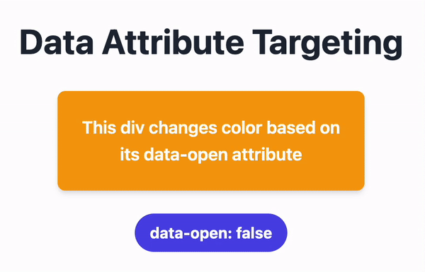
<div
  data-open="true"
  class="data-[open=true]:bg-teal-500 data-[open=false]:bg-amber-500 p-4 rounded-lg"
>
  This div changes color based on its data-open attribute
</div>
This technique allows for reactive styling without custom CSS or JavaScript, making it ideal for interactive components or state-based styling. The div’s background color will change to teal when data-open is “true” and to amber when it’s “false”.
2. Gradient Border (without the use of the border class!)
Creating a gradient border is surprisingly simple with Tailwind:
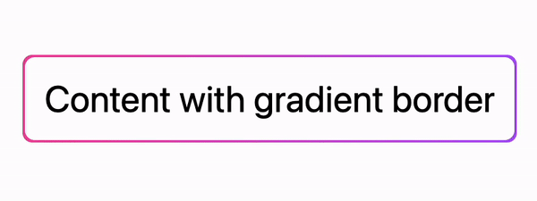
<div class="p-[2px] bg-gradient-to-r from-pink-500 to-purple-500 rounded-lg">
  <div class="bg-white h-full w-full rounded-lg p-4">
    Content with gradient border
  </div>
</div>
This creates a container with a gradient background and places a slightly smaller white div inside, resulting in a sleek gradient border effect.
Tip: reversing the gradient direction on hover will give a nice & fast hover effect hover:bg-gradient-to-l
3. Full-Screen Height Minus Header (My favorite!)
When creating full-viewport layouts, a common issue arises when you set an element to 100vh (100% of the viewport height) without considering the height of a fixed header or navbar. This often results in unwanted vertical scrolling, as the combined height of the header and main content exceeds the viewport height. For example, if we simply did this:
<header class="h-16">
  <!-- Header content -->
</header>
<main class="h-screen">
  <!-- Main content -->
</main>
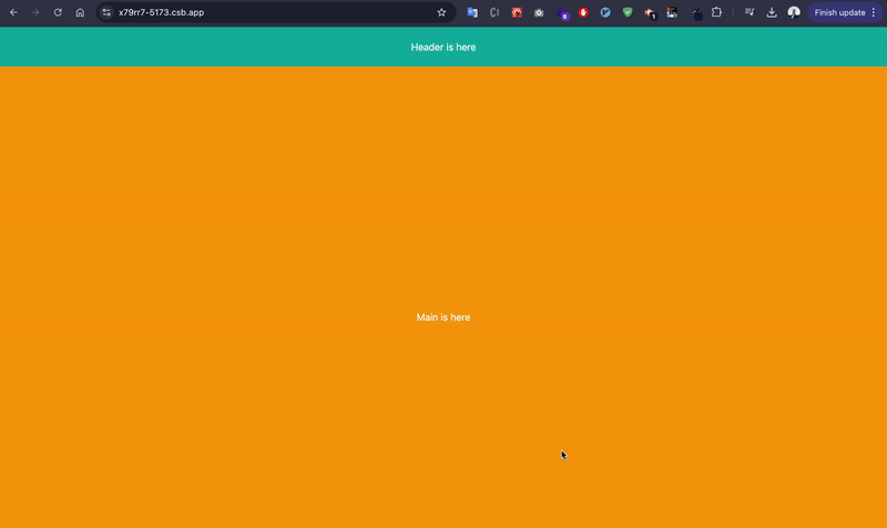
The problem!
The main element would be 100vh tall, but it wouldn’t account for the 64px (4rem) header, causing a scrollbar to appear. To solve this, we can use the calc() function to subtract the header height:
<header class="h-16">
  <!-- Header content -->
</header>
<main class="h-[calc(100vh-4rem)]">
  <!-- Main content -->
</main>
This sets the main content’s height to the full viewport height minus the header height (4rem or 64px), ensuring your content section fills the remaining space without causing unwanted scrolling. To make this a reusable class in a normal HTML or React/Next.js app, you can use the @apply directive in your CSS as follow:
/* In your CSS file */
.full-height-minus-header {
  @apply h-[calc(100vh-4rem)];
}
Then use it in your HTML or JSX:
<main class="full-height-minus-header">
  <!-- Main content -->
</main>
This approach allow you to easily reuse this layout technique across your project, maintaining consistency and saving time.
Conclusion
By leveraging these techniques, you can enhance your workflow and create more sophisticated user interfaces with less effort.